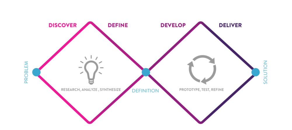
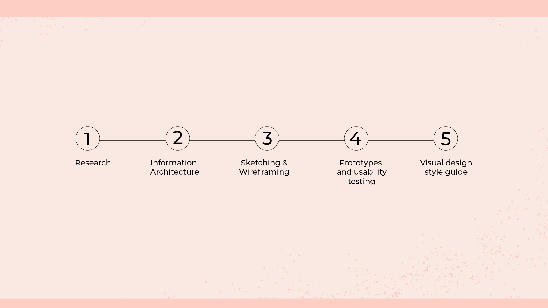
My design process was based on Double Diamond framework. First I started with the research phase to discover information then narrowed the scope through research synthesis to define the problem. After defining the problem, I moved to the next broadening phase of ideation, prototyping and testing my design.
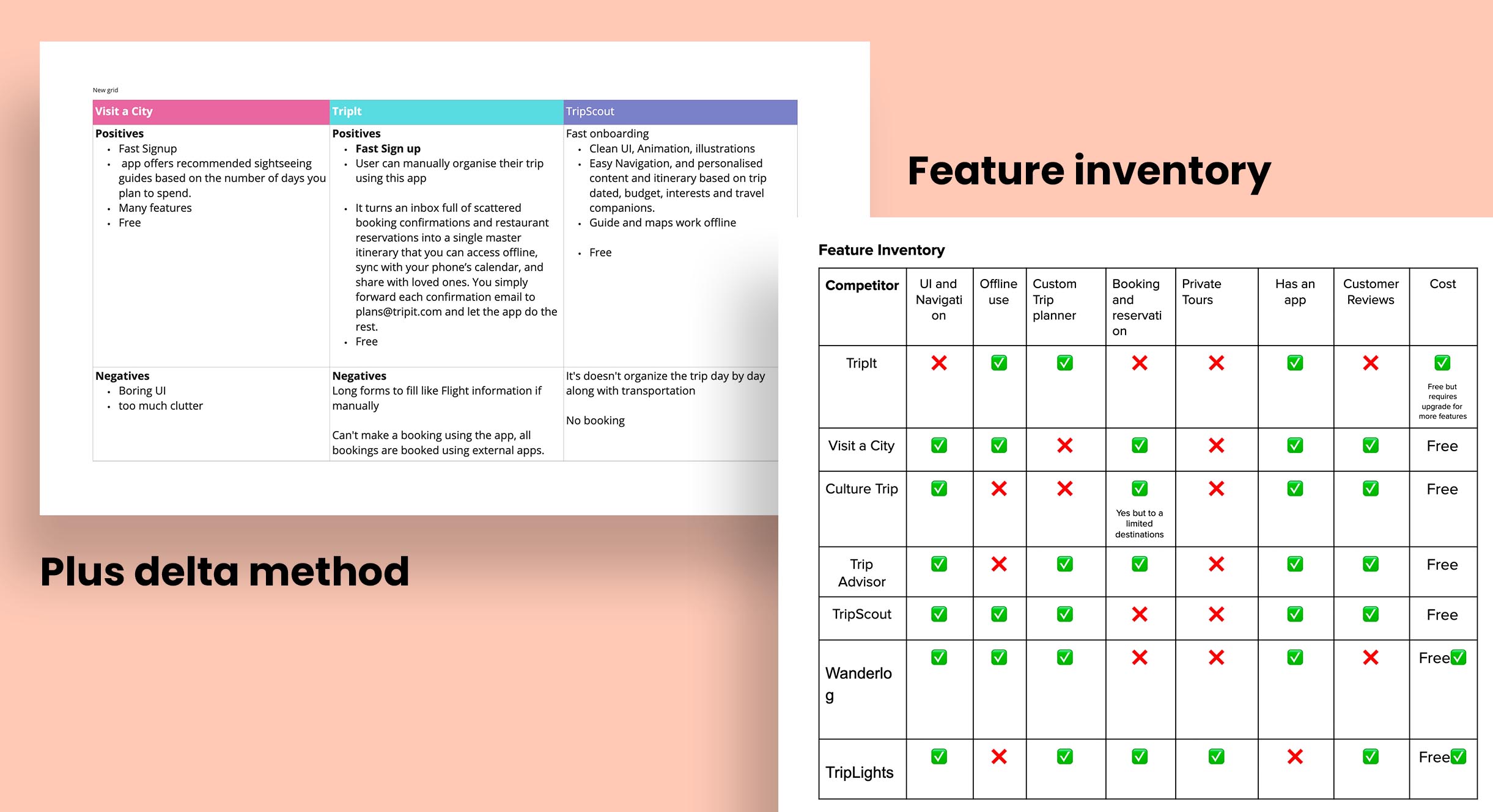
On the research stage, I wanted to learn about Let's Travel users. To achieve this, I conducted user interviews, and competitive analysis to create my persona.
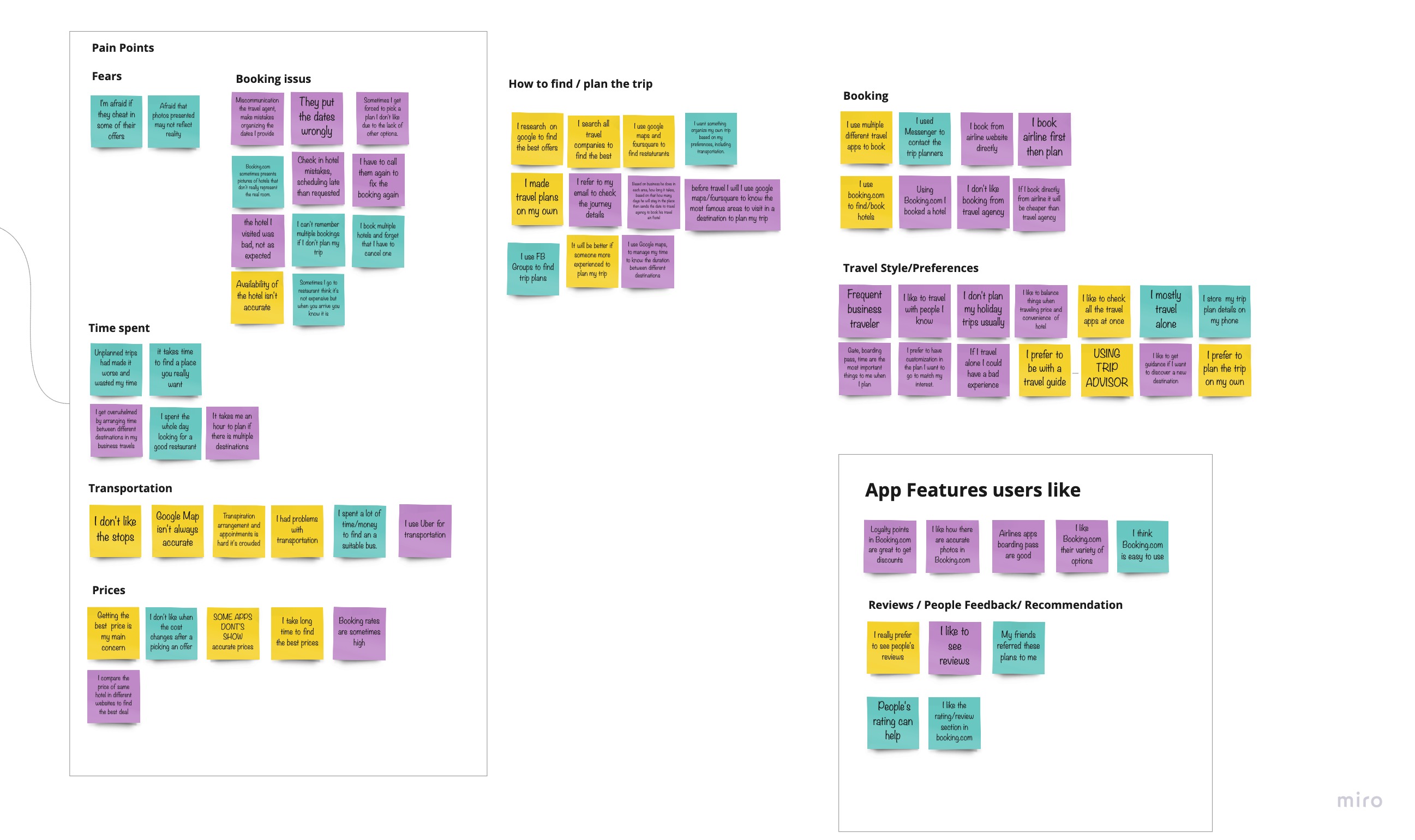
After gathering the raw data from user interviews, I used Affinity mapping to find patterns in my user response, quotes and behaviour.
Three emerging themes after synthesizing my users interview notes:
The goal was to find inspiration in my competitor's success and uncover opportunities in their faults.
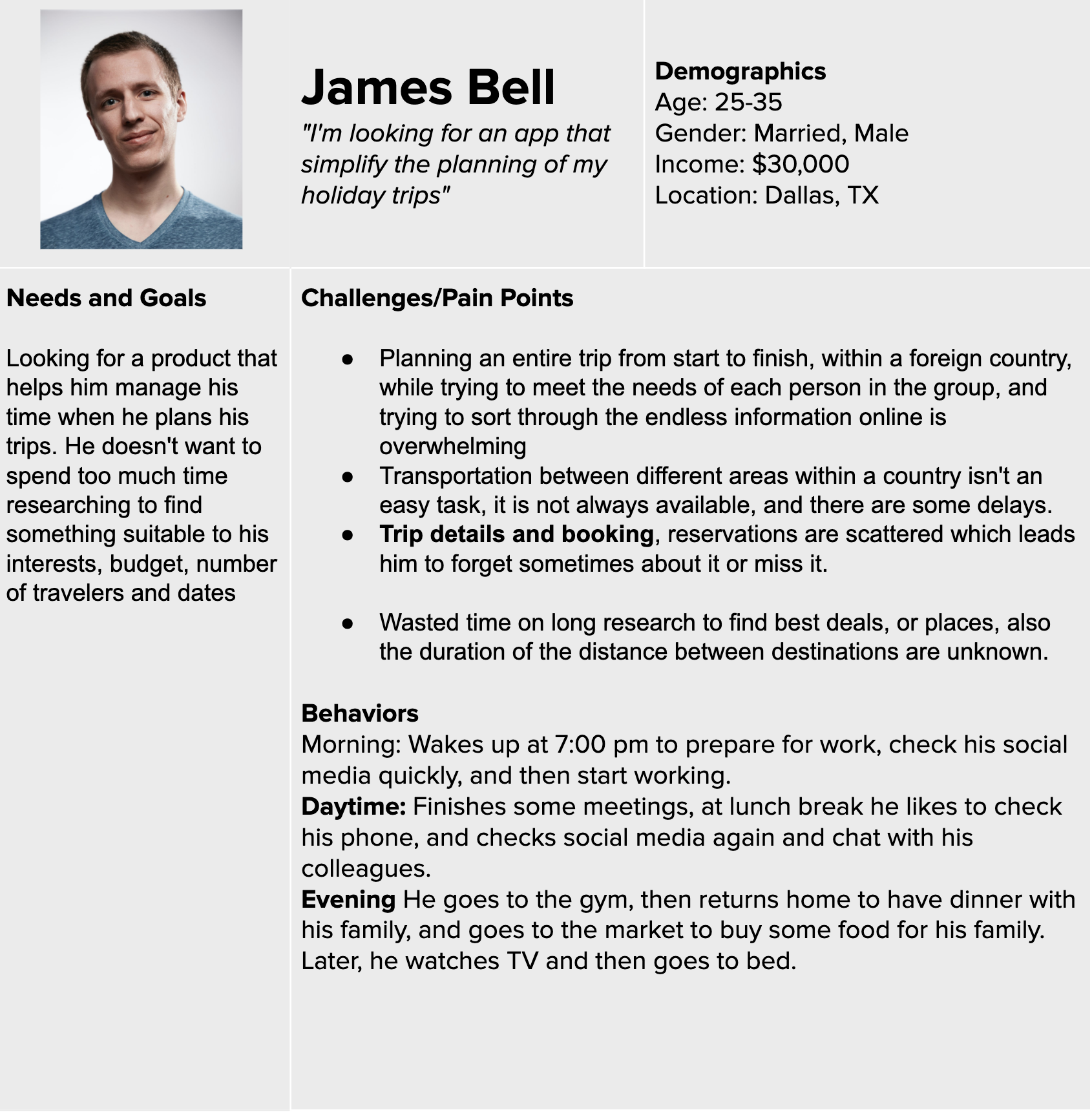
Based on the qualitative data and patterns found in affinity mapping results I created one persona:
To communicate a clear vision, and find a solution, I needed to identify the problem by developing a problem statement and establish a hypothesis
To brainstorm potential solutions for the problem statement with the user’s need and insight, I used the “How Might We” (HMW) framework to brainstorm potential solutions, and create hypothesis to test and validate my solutions

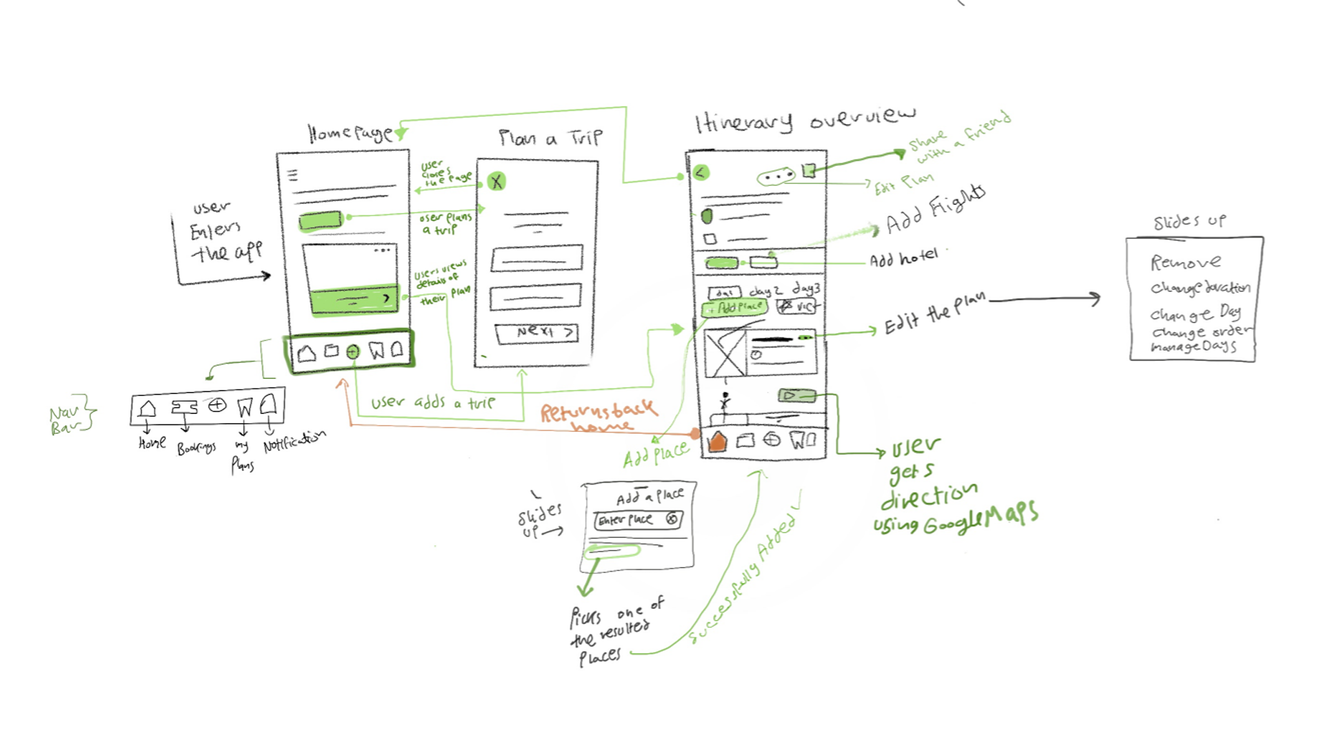
On this stage, I wanted to know how my users will navigate through the app, and how to they expect to see the content, so I started with storyboarding, and created user flow and card sorting
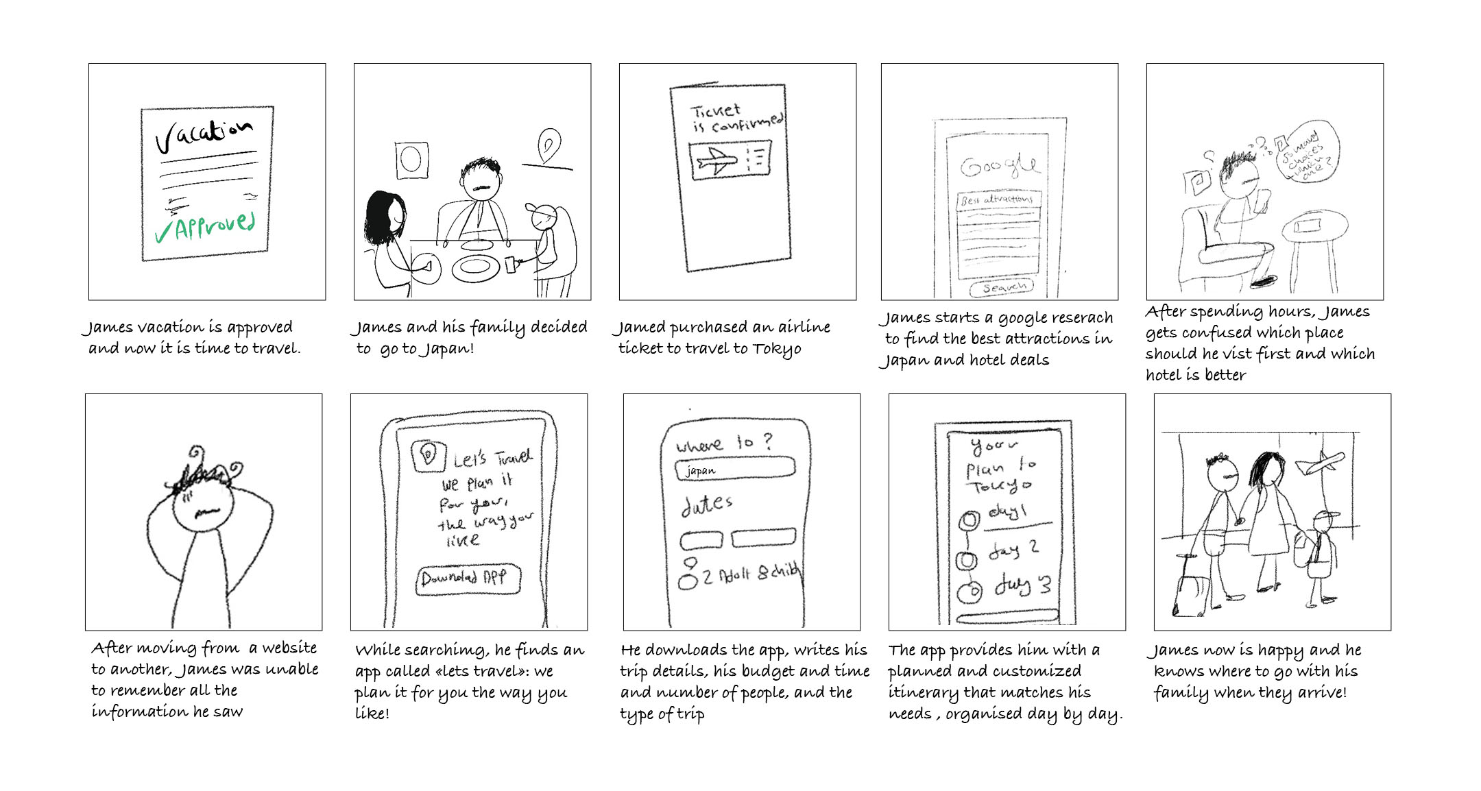
How will the users approach the app and how it's going to help them? I've illustrated a storyboard that exhibits the users' journey, to visually predict the user flow of people interaction with the product , and the actions the users takes to achieve their goals
In this example, James is trying to plan his trip but struggles to plan it easily, read the story to find out what happened with him
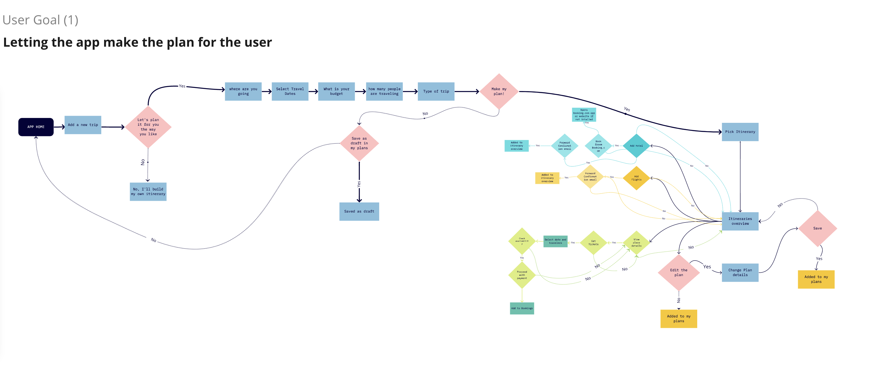
To make an intuitive navigation and understand the steps the users go through in planning their trip, I selected the main task and built this initial user flow
I conducted an open card sorting session with my users.To help shape the information architecture for the design of 'Let's Travel' and uncover how intended users expect to see content and information organized on the product’s app.
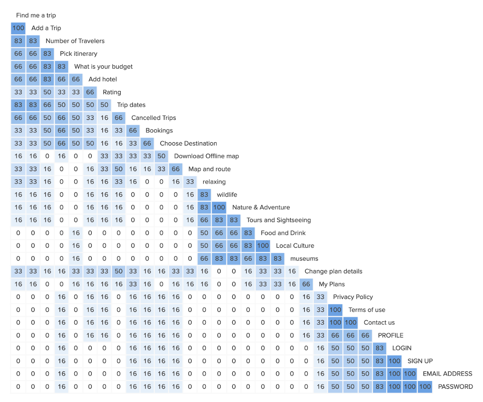
Based on my observation and the data I collected, I found that the majority of participants have divided the below categories in a similar way: (Planning a trip, Travel destination, Things to do, Hotel information/booking, Transportation, Settings. Therefore, the app will consist of these main sections.
Based on the insights gained from the open card Sorts with potential users, I created the sitemap for Let's Travel to help describe the content hierarchy
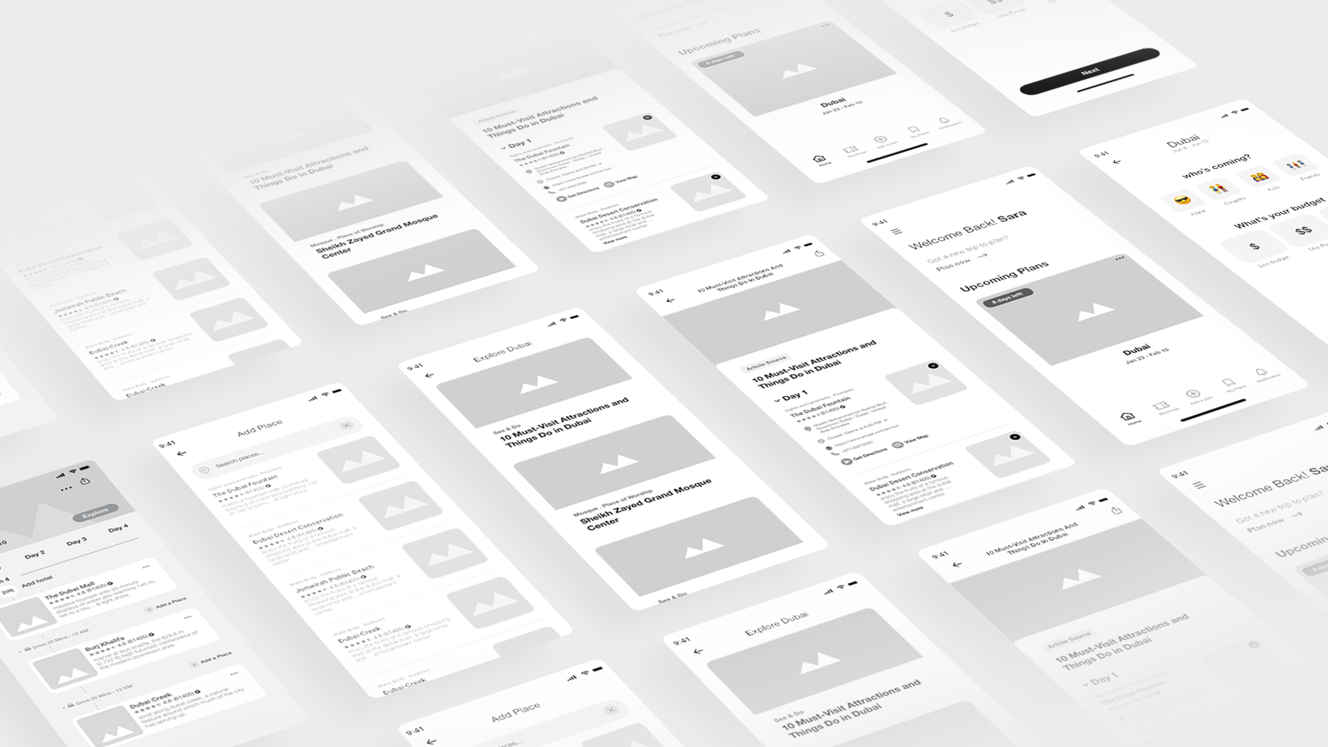
Based on the initial input, I started creating a rough app sketch of the wireframes. Then iteratively moved from rough sketches to high-fidelity wireframes.
To support communication with stakeholders and development team,I added content and annotations to the wireframes:
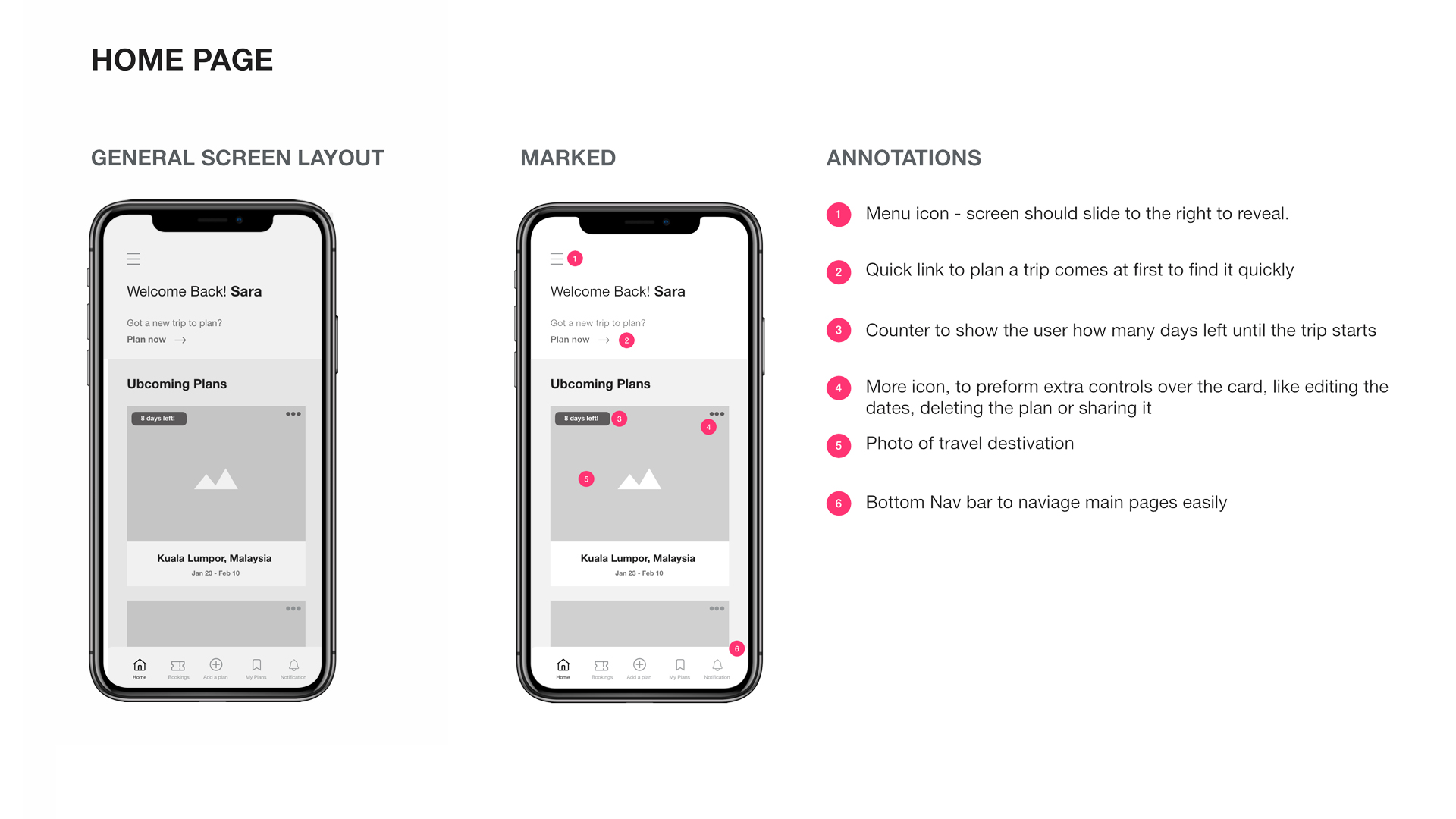
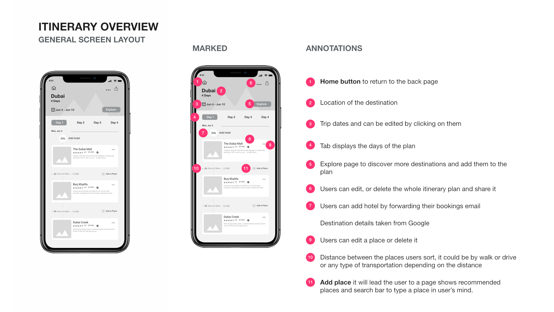
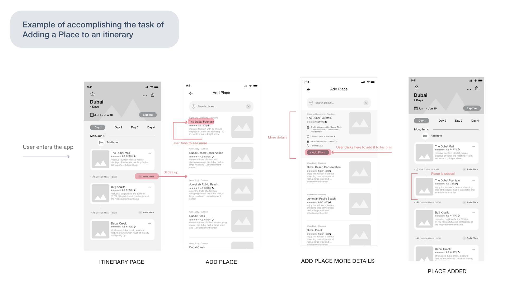
To show how a user would navigate between the three screens, as well as how they would accomplish a task, I created low fidelity and high fidelity wireframes
Elements highlighted in red shows the hotspots that indicates the most important elements in the app and they to represent the navigation between the screens.
I've conducted a usability testing for the first prototype, to validate some of the assumptions I had. The goal was to know how easy and usable the process of making a trip plan and if there are hidden errors that might occur while the user is using the app to fix them early on.
I created an initial prototype based on the insights and the data I collected so far, and tested it with 5 participants. Then, I reviewed the testing sessions recordings to capture their pain points. To help me find the trends and similarities, I used affinity mapping.
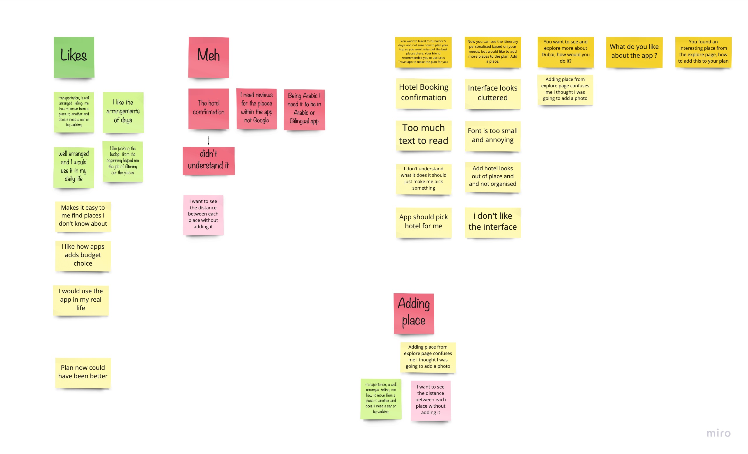
Based on the initial prototype, I did the first round of usability testing, thereby identifying areas that were not clear enough to the end-users
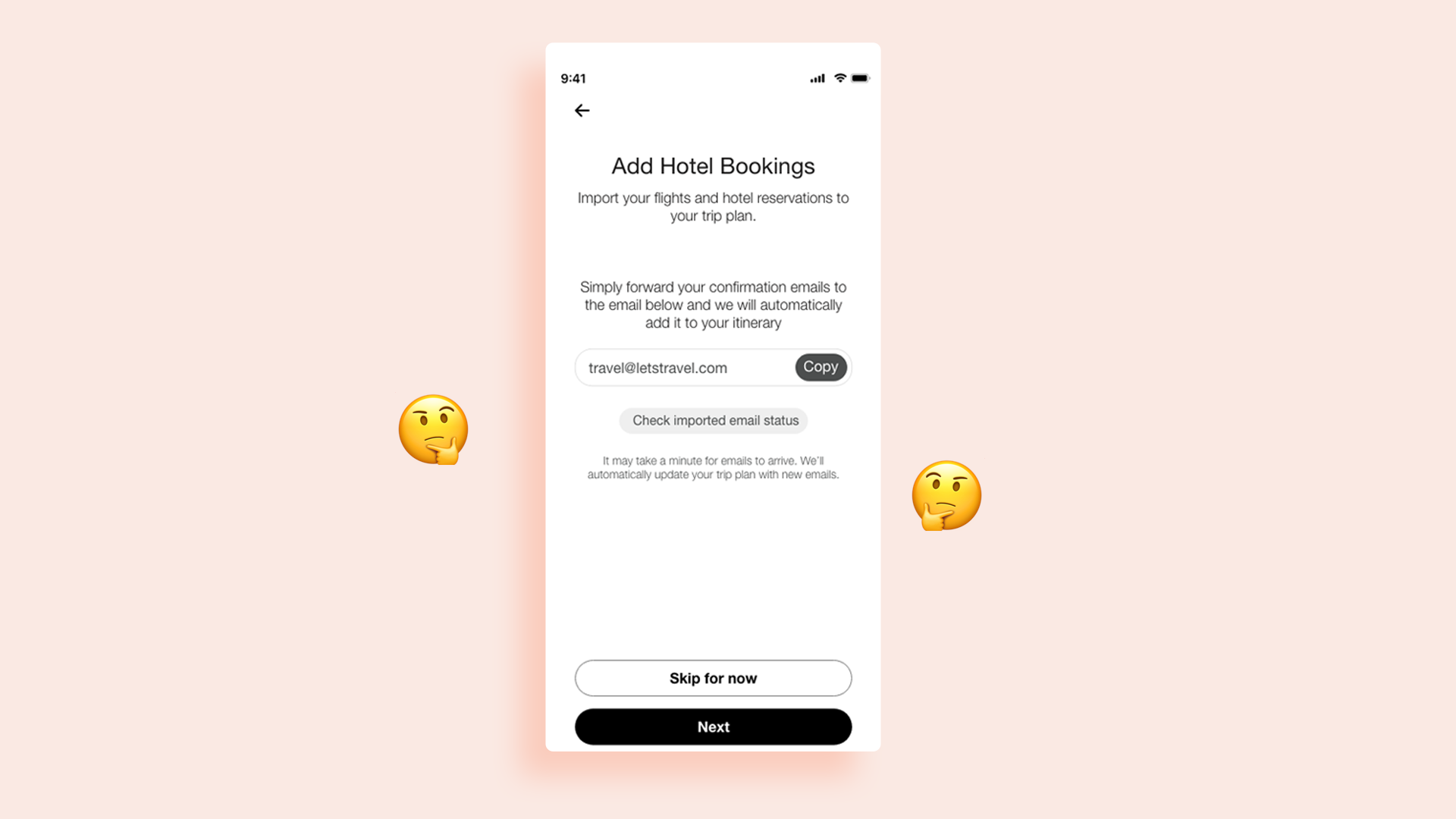
During the usability session, the majority of users failed to complete or understand the sending Hotel confirmation email page. The users spent more than a minute to read while still don't understand what to do or how that should help them.
One user commented "why do I have to read all of this? What I'm supposed to do? The text was too long to read, the process of adding a hotel to the user’s plan isn’t clear and confuses the user which leads to cognitive load trying to understand what this actually does
Solution: Page was removed
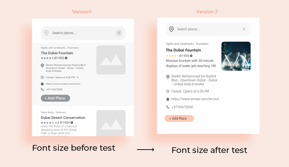
The size of the text was difficult to read and the interface was cluttered. To make the app more accessible and convenient to read, I have adjusted the text size to be more readable.
Solution: Increase the text size to be more readable

After user feedback being confused by the ‘+’ sign over the image, he thought it’s there to add a photo not a place.
Solution: I put add place button outside the image and typed Add a place so it would be easy for them to find it quickly
Usability testing results opened my eyes to many areas that were not clear enough for the end-users. As a result, I did a second iteration to better suit end-users’ needs.
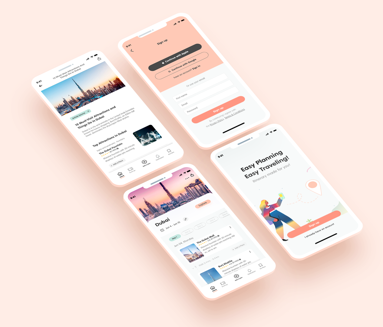
After validating my design assumptions, and applying a second design iteration. I created a solid app structure that caters users' needs and stakeholders' vision.
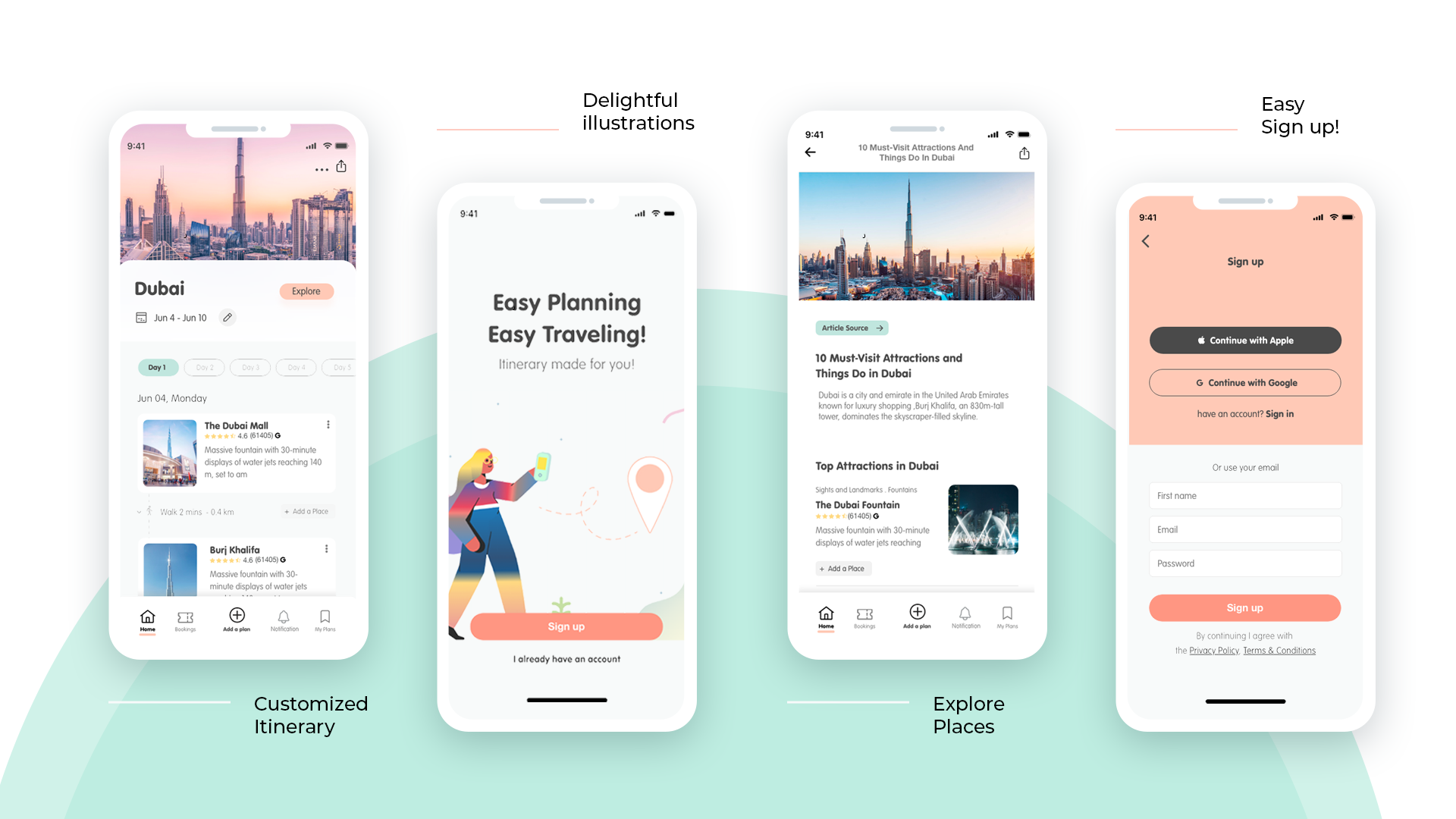
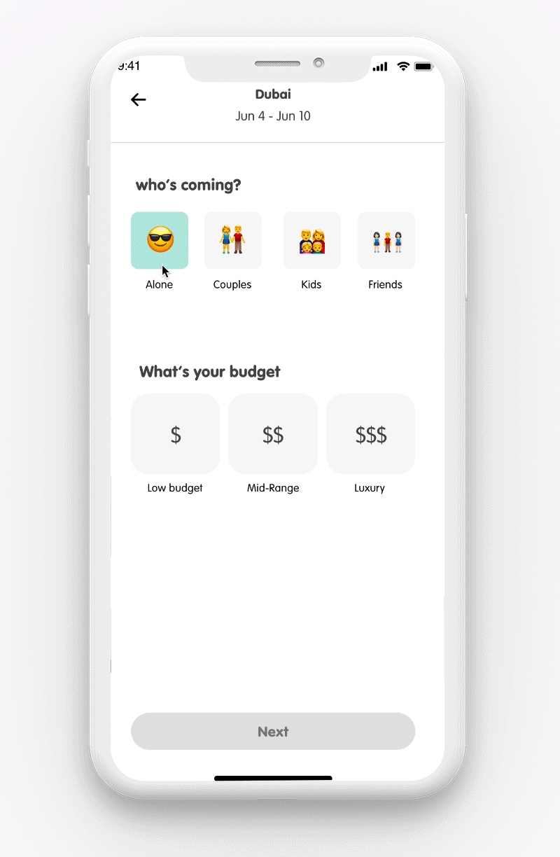
In this high-fidelity prototype, users can pick the destination, budget, dates, and type of trips that suite them, then the app will do the rest.
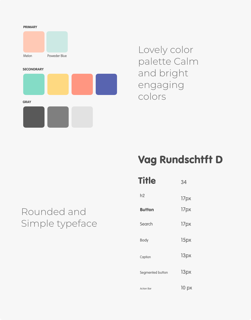
I have developed color and typography for let's travel, rounded typeface and bright colors help make the experience more fun, and gives the impression of simplicity
Finally, after months of working and researching on this project, I have been able to complete the course and produce this version of Let's Travel app based on what users expect and need. By letting the user pick some trip choices based on his/her interest, the app automatically creates a personalised trip that meets their needs and interests. Also, the plan is fully customizable, and saves the users time to research what they are really looking for
This journey wasn't easy, since it's the first UX project I do, but I feel accomplished and satisfied more than ever, because I was able to put users' needs at forefront. The testing provided me some important insights about the users. It helped me make sure the design decisions I take are not biased towards my own opinion.
This journey will never end, the process of enhancing this product is iterative, and will continue to add more features in future to take the user experience of this app to the next level.
If you like what you see and want to work together, get in touch!
RanaAbudeeb@gmail.com